Love ‘em or hate ‘em, popups are here to stay.
If you have browsed the internet any time in the past, oh, few decades or so, we’re sure you’ve noticed the huge increase in popup forms that have been splashing across even the most successful websites.
In fact, popups have become so widely used that even Google had to make an official announcement a few years back regarding the use of “intrusive interstitials.”

Relating mostly to the mobile experience, Google made it clear that popups that covered the main content or displayed before being able to access the main content would not rank well in search results.
That’s because they believe that popups are interruptive to the user experience and are not what people are hoping to see once they land on a website after clicking on a search result.
And yet, people still continue to use popups like they are going out of style.
Which of course, they’re not.
In fact, popups are more popular than ever, despite what Google or site visitors say about them.
Today we are going to take a closer look at the use of popups in online stores.
We’ll check out the pros and cons to using them, best practices you can follow to boost your conversion rates, and even sprinkle some examples of some of the best popups being used across the web throughout for your inspiration.
So, let’s get started.
What is a Popup Form?
Popups, created by the ever-apologetic Ethan Zuckernman, were first designed for a site called Tripos.com, a site dedicated to marketing content and services to graduates.
After trying multiple marketing strategies – selling merchandise, subscriptions, and even a magazine – they found that advertising was what really brought the money in.
And so, the popup was born.
Unfortunately, those popups were widely hated as they were tacky, brightly colored, and simply annoying.
Worse yet, you never really got anything from them except an eyeball worth of unrelated advertisement.
However over time, popups evolved and began catering more to what site visitors wanted, while still trying to advertise.
They also added the element of trying to convince people to subscribe.
Popup forms today are the leading way to display a form to website visitors and encourage them to subscribe to your email list so you can continue your email marketing efforts.
They are perfectly timed, forcing visitors to make an immediate decision whether to subscribe or not.
The best kind of popup forms offer site visitors a special incentive in exchange for an email address.
And popup forms always have a distinct call to action (CTA) that shop owners want their site visitors to act on.
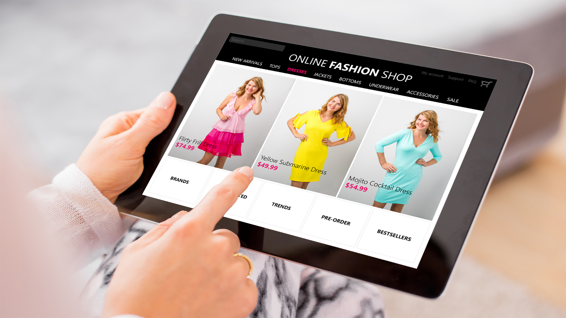
Let’s take a look at the most popular types of popup forms you’ll see on the internet these days.
Welcome Mats
These popups cover the entire screen of your website once a site visitor lands on your site.
They are designed to grab attention quickly, before your visitor gets distracted with other content on your website and fails to sign up.
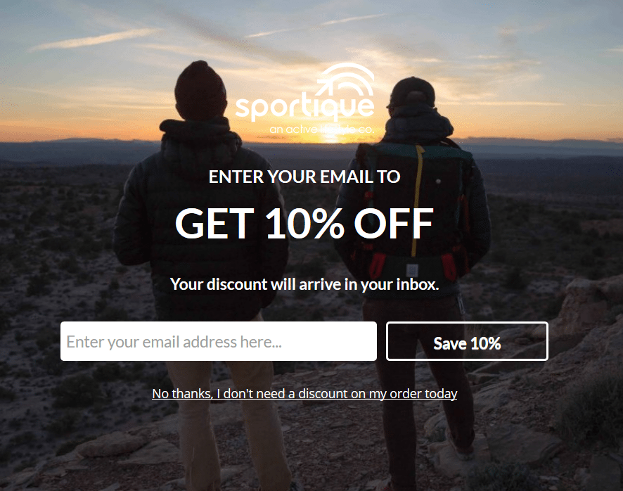
Here you can display a coupon, like Sportique does, showcase new products or services, give insight into what your website is all about, encourage site visitors to subscribe and share, and even gather email addresses as part of a pre-launch phase.
Lightbox Popups
This is the smaller version of a welcome screen popup that lays over the site’s content encouraging a sign up.
Often considered the most effective and popular popup form on the market, these are what most people are used to.
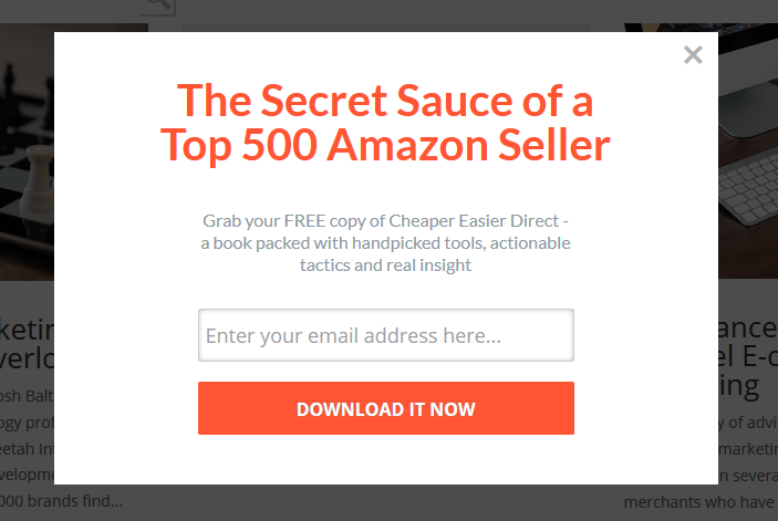
They often have exit intent technology attached to them that trigger when they notice someone is about to leave the website.
In fact, the above example is the very popup we use on our own website in an effort to get people to subscribe at the last second.
Some of the best Lightbox popups offer exclusive discounts to be used at a later date to encourage people abandoning the site to come again when they’re ready.
Top Banners
This less intrusive, those still prominent, popup form appears at the very top of a site’s screen.
However, some are sticky in nature and scroll with site visitors continuously reminding them to sign up.
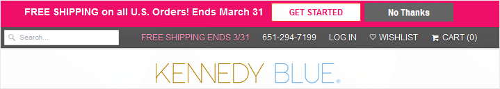
Many of these types of popups will appear with a two-step opt-in process, like Kennedy Blue.
Drawing on the FOMO (Fear of Missing Out) effect, the idea is that once people begin the process of subscribing, and are taken to a new screen, they feel they have to finish.
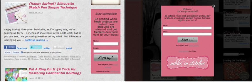
Slide-in Boxes
Slide-in popup boxes are a fancy twist on the lightbox popup.
Sliding in from the side or bottom of the page, like the one found on StockSnap.io, these popups don’t interrupt the user experience as much as a light box popup, though they still grab people's attention.
Many times these popups offer content upgrades or have targeted offers that may push users to visit the online shop and make a purchase.
Adding to this, most popup forms have what are called triggers.
Triggers are the things that cause a popups to appear for a site visitor and include:
- Page Entrance. Display a popup form once someone enters your site. This grabs their attention immediately.
- Page Scroll. Show a popup once someone scrolls a certain length down your content. This is for those that are clearly interested in your content and are likely to sign up for more.
- Element interaction. Turn a link or image into a popup form so when someone clicks with interest they see your form and subscribe.
- Time On Page. Trigger a popup to appear when someone has been on your site for a certain length of time. Take it one step further and have it appear when there is no activity. This works great for customers about to abandon your checkout page.
- Exit intent. Give those about to leave one last chance to opt in and get something special in return, such as a limited time coupon.
- Using site visitor behavior, you can configure your popup forms to appear when they behave on a certain way on your site.The possibilities are endless.
But Do Popups Really Work?
Herein lies the debate of the century.
You have probably heard that popups are dead, that people hate them, and that everyone wishes they would just go away.
But the truth is, popups are not dead.
And, whether people love them or hate them, the numbers don’t lie:
- In less than 2 years, Sumo popup users collected some 23,645,948 email addresses
- Brian Dean from Backlinko boosted his conversion rate from under 2% to an average of 4.83% using an exit intent popup
- WPBeginner went from 60-70 subscribers a day to nearly 470 a day using popups on single blog posts – that’s a 600% increase!
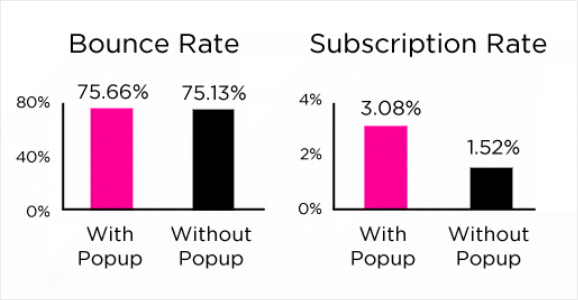
- Dan Zarella shows firsthand how popups increase subscriptions, but don’t harm bounce rates
And the list goes on and on.
The truth is, when done right, popups encourage people to subscribe.
That said, there are some things about popups that are not so great.
For instance, a lot of people really don’t like them like all the hype says.
In fact, some people hate them so much they’ll leave your site immediately if they see a popup.
Not to mention some popup forms can negatively affect your site’s speed and performance, dragging down page loading times.
This not only affects the user experience, whether the popup is appearing in that very moment or not, it also affects your site’s SEO which can make your site rank lower in search results than you want.
Lastly, some popups distract your site visitors because they have the wrong message and cause them not to sign up.
Even if they choose not to abandon your site, the chances they’ll give up their email address is slim to none if they feel your popup is a waste.
And, since having a big email list is the key to growing your business and generating more sales, you definitely don’t want anyone thinking that subscribing is a waste of time.
That said, the fact that popups do more good than not is enough for most marketers to continue using them, despite some people griping about them.
And the other stuff?
Well, that can be avoided by putting a little thought into your popup form’s copy and using a reliable popup form solution.
Still Not Convinced? This is Why Popups Really Work…
Popups can be used to display any type of call to action you can think of.
For example, you can ask people to like you on Facebook, use a coupon in your online shop, or access an exclusive online course that’s free to those that sign up.
No matter they CTA you want to use to capture more site visitor information, a good popup will always work for the following reasons.
1. They Are Attention Grabbers
It can be hard to grab and hold the attention of your site visitors, even once they’re on your website.
But not with popups.
There is no missing those.
This is especially true when you use a lightbox popup, because the rest of your site’s content darkens and all the site visitor sees is the box asking them to subscribe.
Take for instance Whole Whale’s popup.
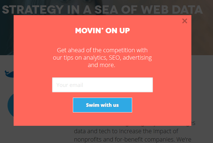
It has a bold color, clear call to action, and appears almost immediately upon entering the site.
This is why it works so darn well.
2. They Have Perfect Timing
If you do it right, you’ll catch people at the very moment they’re ready to subscribe.
For instance, present a popup once site visitors enter your eCommerce shop, like the one seen at Win in Health, and give them a coupon to use in your store, in exchange for their email of course!
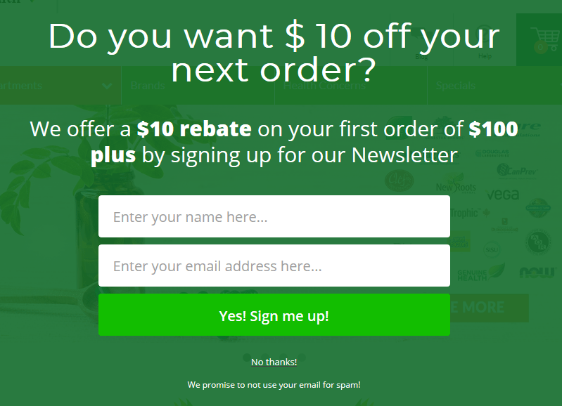
The key here is to decide what kind of visitors are coming to your site, and what you can offer them to get them to subscribe.
Luckily, for those with online shops this is easy.
People want discounts, coupons, free shipping, and exclusive access to products and services.
Another thing to think about is when people are most likely to subscribe.
When people land on your site are they ready to buy right away?
Or do they need to get a feel for how your site is set up?
Do people want to read your blog content and get a product recommendation?
The answer to all of these things will help you decide where to place your popup form.
It will also help you decide which kind of incentive to offer people.
After all, those on the way out without making a purchase will appreciate free shipping more than those deeply engaged with your blog content.
3. They Have a Clear Call to Action
Popups have one purpose – to capture the email addresses of your site visitors.
And, the fact that they only have one purpose makes creating one very easy.
Simply ask your site visitors for their email address in exchange for something great.
Period, end of story.
Your visitors are either going to like what you have to offer, enter their email address, and click submit – or not.
There’s never any confusion as to what action you want site visitors to take, and subscribing is as easy as entering an email, and clicking submit.
A great example of this is seen at Padstows.
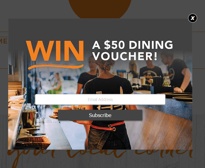
Once their website realizes you are about to leave, a simple popup appears that encourages you to subscribe to their email list if you want to win a $50 dining voucher.
Simple. Exciting. Effective.
This popup has all the elements needed to get someone that might be unsure about Padstows willing to give up an email address for the chance to win some money.
Other Uses for Popup Forms
The great thing about popup forms is they are super versatile.
You can use them for lots of other reasons besides building a bigger email list.
Check it out:
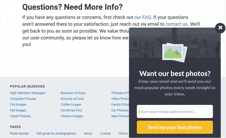
- Stay in Touch. Using exit intent technology, you can create a contact form popup that allows customers that are unsure about your products or have unanswered questions after browsing your site an easy way to contact you and get answers. Plus, you can add helpful information in the popup itself that may answer a customer’s burning question and encourage them to sign up.
- Expand Your Reach. There is no denying the power of social media when it comes to marketing your online shop. People love to follow their favorite brands on social media and retailers boast generating lots of revenue thanks to social shopping. In fact, nearly 2% of all eCommerce traffic in the United States now comes from social networks, with no end in sight. Add you social share buttons to a popup and encourage people to like, tweet, follow, and more. Then sit back and watch your traffic numbers and sales grow.
- Create a Sense of Urgency. One of the coolest ways to get people to make a purchase is to include a countdown timer on your popup form. This creates a sense of urgency and makes people want in before time runs out. And you know what the best part is? You can build you email list in the process using this strategy as well.
- Learn About Your Audience. Another unique way to stay in touch with your site visitors and really find out what they want is to create a survey popup. Gather information about what customers would like to see more of, what they dislike, and how you can make their buying experience better. And again, you can always collect an email address in the process.
See?
You can use popup forms to expand your brand, build better relationships with your customers, and find out what they really want from you.
Popup Form Best Practices
Since popups are not favored by everyone, it’s important you follow popup form best practices so your don’t end up driving traffic away by using them on your site.
To start, always offer something your target audience really wants.
Popup forms alone are not going to convince people to sign up.
But a great incentive that provides value to your customers will.
Don’t just offer something for free in exchange for an email address and hope people subscribe.
Take the time to think about what people will really benefit from and give them that instead.
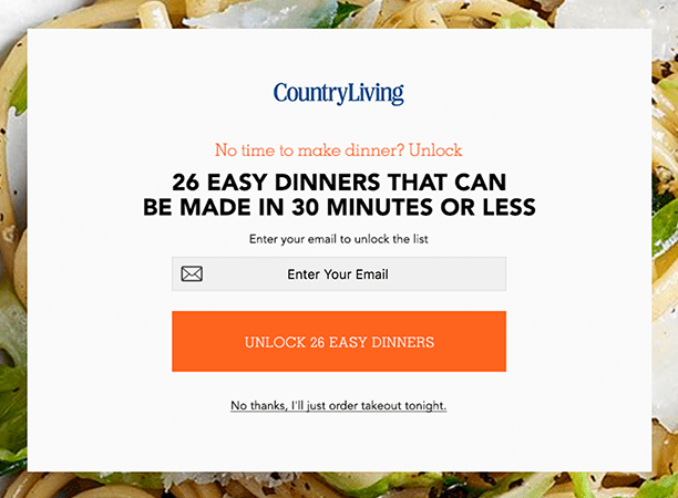
For instance, those browsing recipe articles see the following popup when on the CountryLiving website.
Next, always keep your mobile users in mind, like Ian Anderson Gray does on his mobile site.

After all, 62% of smartphone users report having made an online purchase on their mobile device within the last 6 months.
And remember, Google will penalize anyone that is providing a poor user experience with their popups.
Make sure your popups aren’t overly distracting, function properly on mobile devices, and are easy to get rid of if someone doesn’t want to subscribe.
Lastly, make the form short and simple.
One of the appeals a popup form has is that they are clear, simple, and easy to use.
There is no reason to gather more information than a visitor’s name and email, no matter what you’re offering them.
Don’t distract people with long forms that they are likely to abandon.
Popup Form Solutions
Okay, now that you are totally convinced popup forms are actually a good thing, it’s time we share with you some of the best ways to create a popup form on your eCommerce site.
- Popup Plugin for WordPress - ConvertPlus – Exit intent, slide-ins, and even video popups are just some of what this plugin gives you.
- OptinMonster – Suitable for WordPress or non-WordPress sites, this standalone solution has plenty of campaigns, trigger options, A/B testing, analytics, and more.
- Bloom – Create beautiful popups from over 115 templates and even A/B test your popups to make sure they’re working.
- SumoMe – This free WordPress popup plugin is perfect for those wanting to build a bigger email list.
- Thrive Leads – This well-known lead generation plugin has advanced analytics to get you on the right track with your eCommerce marketing.
- Icegram – Not only can you create awesome popups, create powerful CTA buttons that direct visitors all over your site too.
- Shopify App Store – Packed with apps like Pixelpop, Smart Popup Box, and
HubSpot Lead Flows, you’ll find everything you need to create highly converting popups here.
And there you have it! The ins and outs of using popups on your website.
We know that’s a lot of information to take in all at once.
And when it comes to building a bigger email list, growing your business, and forging stronger relationships with customers old and new, there is a lot to think about.
However, popups really do work.
And since they are a simple marketing technique you can easily add to your website, they are something you should consider adding to your site right now.
After all, the faster you can start collecting email addresses, the faster you can start handing out coupons, discounts, and promotional items to your future customers, and the faster you can start generating more revenue.
Be the first to know
Subscribe to our newsletter


